Pattern Scale for Sample
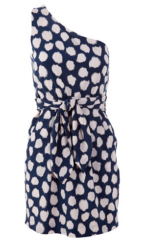
The size, type and colour contrast of the patterns you wear can have a great affect on your overall perceived weight.As a general rule, the larger the pattern, the larger you will appear.
Patterns with a high colour contrast have a stronger effect than those that are subtly coloured.
When it comes to business wear keep patterned garments subtle and wear no more than one at a time.
Spend your money wisely when it comes to patterned garments.
While some are classics, many go out of fashion quickly.
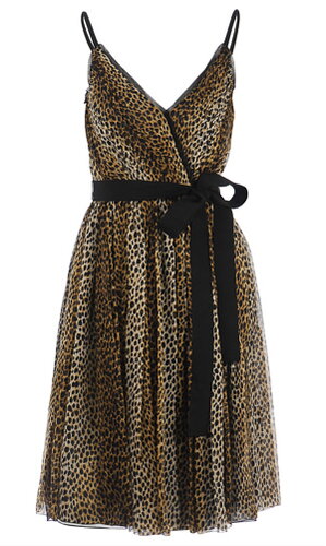
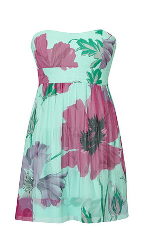
Patterns also have an image, leopard is dramatic and strong, stripes are steadfast and sensible , paisley is conservative and mature, and florals are feminine and gentle.
Select patterns to suit your personality, while also being appropriate for the situation, occasion and company.
Many \'Plus size\' designers mistakenly believe that all plus size women can wear plus sized prints, when in fact medium sized patterns in a medium to subtle contrast will best suit those who are plus size and medium to short in height.
While medium to large sized patterns suit those who are plus sized and tall.
The same size guidelines apply to all accessories, collars and lapels, pockets, embellishments and hairstyles.
Patterns that are angular are more slimming and have a stronger overall image than those with rounded designs.
Vertical patterns are authoritative, slimming and elongating.
Horizontal patterns are stable, conservative and broaden the area to which they have been applied.
Diagonal patterns are interesting and dynamic .
The more vertical the diagonal the more slimming it is.
Curved or circular patterns are graceful, feminine and quiet.
They tend to add weight and width to the area they are applied to.
High colour contrast (\'wow\' colour contrast) is akin to power dressing and is perceived by the public to be authoritative, outlandish or aggressive.
They are best kept for festive occasions (2 bright colours together), or when extreme presence and authority is called for ( dark with bright colours).
High contrast It is not people friendly.
Medium colour contrasts (light and dark combinations that are comfortable to look at) are notable, professional and people friendly.
It is perfect when friendliness and professionalism are required.
Low colour contrasts (colour combinations where there is little to no value difference between the colours) are generally submissive, quiet and passive.
They are perfect for situations when you want to blend into the background and observe.
They are not recommended when any level of \'presence\' is required.
Your bone structure, height and weight make SMALL to MEDIUM your best scale for prints, patterns, jewellery, hats and hairstyles.
Large scale items have the potential to overwhelm your scale.
To gauge the size of patterns look for where the pattern is repeated and use your hand to gauge the size; small patterns will fit into the cup of your hand, medium patterns from the centre of your hand to the middle joint of your forefinger and large patterns will be anything larger than fall outside of your middle finger joint.
Avoid obvious repeat prints i.e., where there is a large solid space of colour between patterns as these will overwhelm you.